Do you have problems integrating and customizing Community Sites using Lightning Components?
This article shows you how you can develop and customize community sites with the Lightning Components framework using Salesforce’s flexible Customer Service template (formerly known as the “Napili template”). By using Lightning Components on top of the customer service template, developers can implement customizable components for the administrators far more easily than in the past.
So what is the Customer Service template exactly?
The Customer Service template is a responsive Salesforce community template that lets you build and customize community sites more easily. It lets you better connect with customers in their organization; more easily post and search for questions and articles; and enables users to contact a support agent within the Customer Service template. In short: it gives a lot of flexibility to developers and administrators.
There are however browser limitations for the Customer Service (Napili) template:
- BlackBerry and Windows Mobile systems are not supported
- Internet Explorer 11 and previous versions are not supported
Compared with the Koa and the Kokua community templates the Customer Service template is supporting more standard objects including Accounts, Opportunities, Leads and Campaigns. You can find more comparisons with this link.
Using the community builder
If you didn’t set up a community yet, we recommend you follow this link to create a new community.
- Select the Customer Service (Napili) template as the community template.
- Once you have created the community you will be able to navigate to the community builder.
- By using the community builder you can create every kind of page that you want and customize it with the help of standard components and custom Lightning Components.
- Previously developers and administrators used site.com studio and site.com sites to implement community sites: the community builder has now replaced site.com studio, but site.com studio is still used on some occasions.
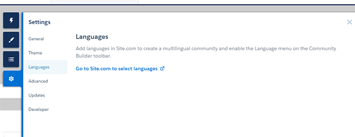
- As an example, if the administrator needs to add languages to the community sites, they need to navigate to the settings in the community builder and redirect to the site.com.
In the image below you will see how to navigate to the site.com from the community builder.
Configuring the page access settings to define public access for the community
If the administrator is focusing on the public pages he needs to consider the Page Access Settings and Guest User profile to give permissions for objects and Apex classes and triggers.
You can navigate to this link for the public setup access for the guest user profile. Having done the public setup access you will need to configure the page access settings of the particular community page.
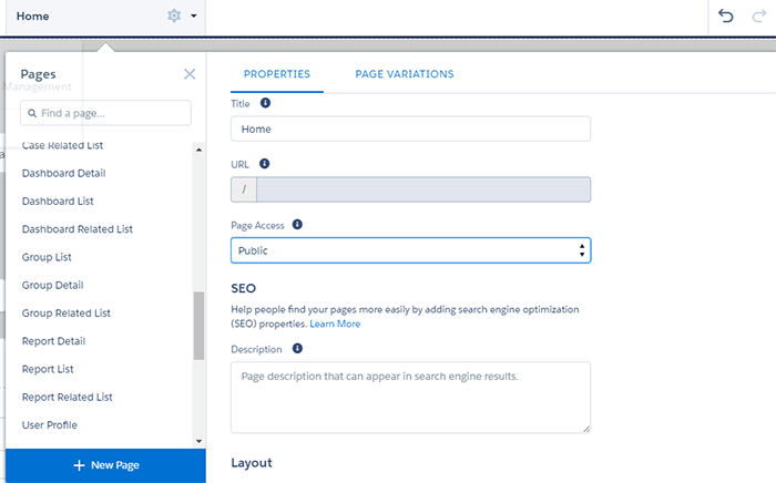
- Select the page you want to give the community public access to from the community builder.
- Click on the Settings icon and navigate to Properties.
- Set the page access to Public.
Note: even with the page access set to Public, the page may not be visible for the public users, because you need to set the guest user profile to the relevant objects, classes and triggers of the community page.
Community builder has an administrator friendly “drag and drop” environment to implement and customize the community sites. Furthermore with the community builder we can reuse and customize many more Lightning Components or we can install Lightning Components from the AppExchange directly via the Community Builder.
In order to make the Lightning Components visible in the community builder, we need to make the community available for all pages by adding the aura:component tag as below:
<aura:component implements=”forceCommunity:availableForAllPageTypes” access=”global”>
—
</aura:component>
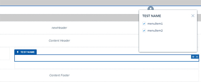
An interesting feature in the Lightning Components, which are developed for the Customer Service template, is that developers can set the customization attributes that are visible in the community builder. As an example, think about a Lightning Component with multiple menu items. If the developer needs to give the administrator the ability to choose which menu items should be displayed in the Lightning Components menu, the developer can easily add the design attributes in the Lightning Component itself.
E.g. In the Lightning Component, we will be able to see the menu item below on the left side of the developer console:
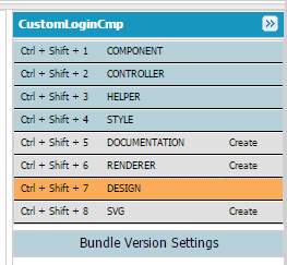
In order to add the attribute you need to click the orange colour DESIGN tab in the menu. Once you click on it you will see the design file in the developer console. Then you’ll need to add the code below in the design file:
<design:component >
<design:attribute name=”menuItem1″ default=”true”/>
<design:attribute name=”menuItem2″ default=”true”/>
</design:component>
Here, we set the menuItem1 and menuItem2 as a Boolean Value and set the default value to true.
Then you need to click on the COMPONENT tab on the left side menu in the developer console and add the below attribute in the component (.cmp) file:
<aura:attribute name=”menuItem1″ type=”Boolean” required=”false” />
<aura:attribute name=”menuItem2″ type=”Boolean” required=”false” />
In this attribute you must ensure you make the name identical to the attribute created in the design file. Also the type needs to be identical as well. (If it’s necessary you can set a required attribute and/or a default attribute). Then you need to navigate to the community builder and add that particular Lightning Component by dragging it from the custom Lightning Components menu. Once you click on that Lightning Component, you will be able to see the custom attribute that we already created in the design file of the panel, which is located on the left side of the Community Builder.
Once the administrator changes the Boolean Value and then publishes the community site, the attribute value will be the administrator-selected value for the particular Lightning Component. According to that value the developers can implement customizable Lightning Components for the Customer Service template.
If you set a name in the design:component as below you can even create a name for that panel.
<design:component label=”TEST NAME”
If you create an aura:if markup tag in the Lightning Component for the menu item attributes, you can see the real time reflection in the community builder when the administrator changes the value. Below you can see how to use aura:if tag for the menu item 1
<aura:attribute name=”menuItem1″ type=”Boolean” required=”false” />
<aura:if isTrue=”{!v.menuItem1}”>
You will see the menu item 1 content
<aura:set attribute=”else”>
You will not see the menu item 1 content
</aura:set>
</aura:if>
It is also possible to customize the theme layout, standard profile header, search and post publisher components and content layout in the Customer Service template by overriding the standard components. The links below will describe how to override those standard components.
- Create a custom theme layout to overwrite the appearance and overall structure of the pages in the Customer Service template
- Create custom components to replace the Customer Service template’s standard profile header and search & post publisher components in the community builder
- Create custom content layout components for communities to update the content layout of the default pages that come with your community template
Salesforce has implemented the template-driven community experience even better in the winter ‘17 release for the developers and administrators. https://releasenotes.docs.salesforce.com/en-us/winter17/release-notes/rn_networks.htm
Do you also want your own customized customer portal? At PwCwe can support you with this.